Although usability testing and research before launching a product are extremely helpful, there are issues that only pop up once a product is being used. This is a case study of a feature we modified only after it was already live.
First, a bit of background on collection permissions
Collections are databases where Wix users store content when building their site. When we noticed a large volume of customer support tickets about collections, we knew we had to take action and design a better flow. Collections are commonly used for:
- Managing content to display on a site (i.e., properties for a Real Estate Company)
- Collecting submissions from website visitors (i.e., testimonials or feedback forms)
- Storing sensitive information (i.e., emails)
This is a case in which an unusual volume of customer support tickets helped us design a much better flow for setting permissions in one of our main products: collections. Together with UX Designer Admon Gal, we set out on a quest to make finding collection permissions as easy as possible for our users.
Depending on how a collection is used, users need to be able to change its permissions and privacy settings accordingly.
Too many support tickets is always a red flag
Over a 6-month period, we found 1,665 tickets related to issues with collection permissions.
Upon analyzing the data, we decided we could improve the following areas:
- Discoverability
- Terminology
- Transparency
It turns out that 60% of users were unaware of collection permissions. A lot of times, the user’s intent was to edit privacy settings, but they didn’t understand the connection between editing permissions and privacy settings.
Additionally, out of those who were aware of permissions, 25% didn’t know where or how to customize them without contacting support.
Improving discoverability for collection permissions
As UX professionals, we are constantly calibrating the importance of a specific feature within the user journey. What does a user need to know? When do they need to know it? When does information have to be visible, and when can it be less prominent?
Originally, our decision was to “hide” collection permissions under ‘Additional Settings’. We decided to reduce friction by hiding it behind a secondary tab, based on the assumption that most users wouldn’t need to customize permissions at all. But as Steve Jobs once said, sometimes “you can only connect the dots looking backwards.”
Once the feature was live, our initial assumption was proved wrong: most users did need to customize permissions. In fact, users tried editing the privacy of their collections, and they couldn’t understand the connection between permissions and privacy settings.
We started out with the following improvements:
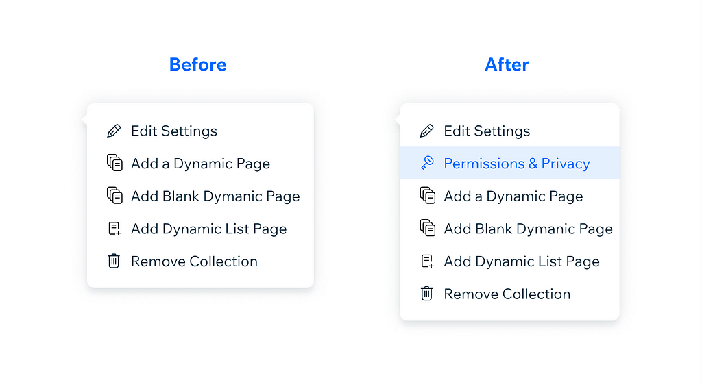
- Adding a new entry point to make the feature easier to find.
- Renaming the feature to include the word privacy in order to match the user intent of editing privacy settings for collections.
Making collection permissions more intuitive
With collection permissions more discoverable, the next challenge was making the entire experience more intuitive and easier to use.
Originally, we split permissions into presets, thinking this would make it easier for users to set the right permissions for their collections with minimal cognitive load.
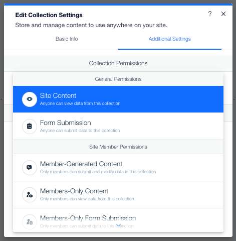
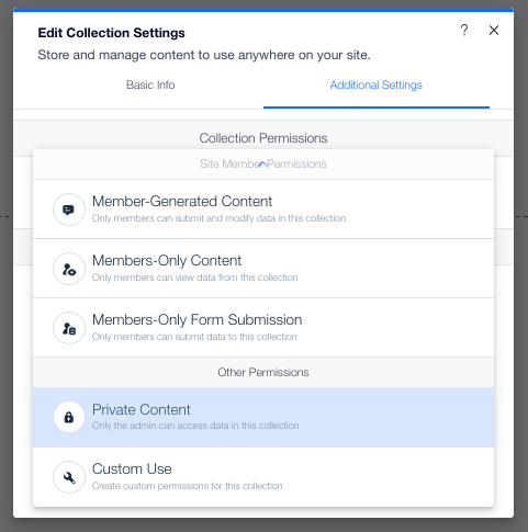
Each permission preset actually consists of four different sub-permissions:
- Who can view content in a collection
- Who can add content to a collection
- Who can delete content from a collection
- Who can update content in a collection
Over half of the users who contacted support didn’t understand the most important part of presets: their sub-permissions. So, it’s no surprise that most of them failed to customize them according to their needs.
Before contacting support, 7.6% users customized a collection permission. After contacting support, that number became 45.5%. This meant two things:
- Many users needed to customize permissions
- Users didn’t know how to customize permissions by themselves.
When simple becomes complex
By over-simplifying the experience–trying to use a short title and short description to explain presets–we were failing to adequately explain what a preset was.
The issue we had could not be solved by content alone. It was time for a complete redesign.
Our redesign had two main goals:
- Making permission settings easy to understand
- Simplifying the preset customization process
Based on our goals, we came up with the following improvements:
- Turning ‘Permissions & Privacy’ into its own tab in the collection settings panel. This also gave us the additional space we needed to display sub-permissions for each preset.
- Simplifying preset titles and changing how each was explained.
- Making presets easier to customize by letting users edit sub-permissions to fit their needs.
- Updating content and information hierarchy to make the flow more conversational.
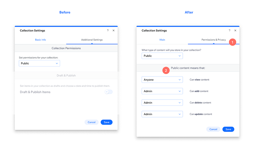
How our UX methodology helped us achieve our goals
By carefully following UX methodologies, we were able to achieve great improvements through this project.
Research and analysis
Before designing a new user experience, we analyzed the volume of related support tickets as well as user actions before and after contacting support in order to understand exactly what the user intent was.
Based on our findings, we concluded that users were struggling to find and edit permissions, as well as what each permission meant.
Improvements and conclusions
We added a new entry point for ‘Permissions & Privacy’ from collections, and we also changed the design of the ‘Edit Collection’ panel to provide more accurate information upfront. Due to these changes, we saw a significant uplift in changes made to collection permissions without contacting support. This indicates that our changes helped improve discoverability.
We simplified the terminology throughout the entire experience and also updated the information hierarchy in the panel to provide better understanding of collection permissions. The UX and UI improvements resulted in fewer issues related to permissions reported to customer care.
Also, when customer care issues did occur, our customer care team spent less time explaining how to set collection permissions thanks to a more intuitive experience.
Thus, by adopting a user-centric approach, we came up with a solution that led to a more intuitive user experience with improved discoverability.
If you would like to read more case studies like this, make sure to comment below.
Special thanks to Noy Misgav for helping me organize and edit this article.
Is there a topic you want to see covered by the Wix UX team? Let us know by filling out this form.
Case study: Designing a better experience for permissions was originally published in Wix UX on Medium, where people are continuing the conversation by highlighting and responding to this story.


