Sticky content helps prioritise important content so it's always visible, but it can create issues for sighted people who use a keyboard, or a keyboard-like device, as focused controls become hidden behind the sticky content.
This post discusses how you can keep controls behind sticky content visible and usable when they receive focus.
A small amount of CSS is all it takes to make it possible for people to see the content they are interacting with and help you meet the existing 2.4.7 Focus Visible (AA), and the proposed 2.4.11 Focus Not Obscured (Minimum) WCAG success criteria.
If you're not familiar with focus styles, we cover what this means and how you can create visible focus styles in our blog post: Foundations: visible focus styles.
The problem with sticky content
Sticky content remains visible over other content on the page, ensuring the sticky content is always available. It's an effective way of allowing you to visually find important information you may need, at any time. For example, many websites use sticky headers to keep controls visible on long pages to save you from scrolling to the top of the page.
However, sticky content can obscure content beneath it, and if you use a keyboard to navigate, there may be controls that receive focus, but you can't see.
In this case, the browser is doing everything as expected: the sticky content remains visible and the control receives focus. However, the issue is that the focus is not visible to us.
This current behaviour fails 2.4.7 Focus Visible (AA) and 2.4.11 Focus Not Obscured (Minimum) because the focus indicator is not visible, nor is the control that receives focus.
Resolving the issue with scroll-margin / scroll-padding
We can use the relatively recent scroll-padding and scroll-margin CSS properties to resolve this issue. These control the padding and margin that are applied to scrollable areas, particularly when content scrolls as a result of keyboard focus being moved. Note that scroll-margin currently has some bugs / browser incompatibilities (particularly in Safari), so we recommend using scroll-padding at the time of writing.
Use the scroll-padding property, setting its value to the height of the "sticky" element. If you're unsure about the element's height, you can use your browser's Developer Tools.
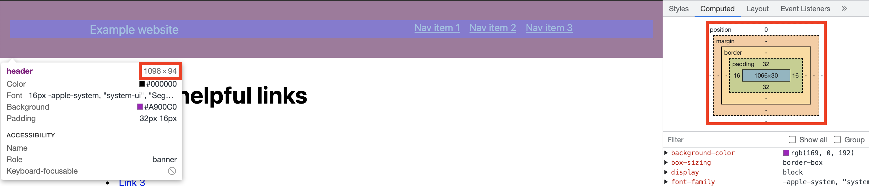
The approach works best if you use rem or em units which will scale alongside any zoom or text sizing applied. In the following example, the container has a height of roughly 6rem. Based on this, the CSS you'll need to add is:
scroll-padding-top: 6rem;To ensure this is applied, you must add the styling to a scroll container. Chromium-based browsers allow this to be applied to the elements themselves, but Safari requires it to be applied to the scroll containers. In the following example, we've chosen to apply it to anything in the HTML or body elements (<html>, <body>).
html, body {
  scroll-padding-top: 6rem;
}
By adding this CSS, when elements receive focus, the page will scroll them into view as normal but will also take into account the scroll padding, making sure that they don't land behind the sticky content.
Similar use cases
You can add scroll padding for similar use cases, such as a cookie banner that may be visible.
In the demonstration below, a cookie banner remains visible at the bottom of the screen until it is dismissed. As with the sticky header, we don't want the content to receive focus behind this control. You can resolve this by adding scroll padding. However, as this content can be dismissed, we may not always want a large amount of scroll padding to be applied if it's not visible. In this case, we can use the has() selector to only apply the scroll-padding-bottom when the banner is visible.
:is(html, body):has(aside) {
  scroll-padding-bottom: 6rem;
}Shortcomings
One of the limitations of the scroll-margin / scroll-padding approach is that you will need to know the exact height of the sticky content. This may not always be known ahead of time, particularly if the dimensions of the sticky content container can change based on the actual height of its content. In those cases, you may have to resort to additional JavaScript to dynamically change the value of the scroll-margin or scroll-padding.
Summary
scroll-marginandscroll-paddingcan be used to allow controls behind sticky content to become visible when they receive focus- Paired with the right CSS selectors, the behaviour can be made specific to the sticky content visible on the screen
Related WCAG 2.1 Success Criteria
- 2.4.7 Focus Visible (Level AA)
More information
Next steps
Read more about accessible design systems, or how our documentation and consultancy services give you the information you need to build accessibility into your products early from the start.


