Colour is a valuable tool for communicating meaning. But if you can't see colour, then meaning is lost. Always plan to use colour to convey meaning in combination with another means of identification.
Colour and meaning is difficult or impossible to see for many people, for example:
- People who are blind browsing with a desktop screen reader or browsing with a mobile screen reader wont be able to see colour
- People with low vision can find colours difficult to see
- People who are colour blind may not be able to tell the difference between certain colour combinations
- People with Autistic Spectrum Disorders may not understand or interpret colours in the way they are intended
- People browsing with black and white displays wont be able to see colours
Rules for using colour
As well as having good colour contrast, colour should never be the only way to identify something. Colour must always be accompanied by other means of identification. This could be visible text, underlines and borders for visible focus styles, or shapes depending on the type of content being displayed.
Form errors
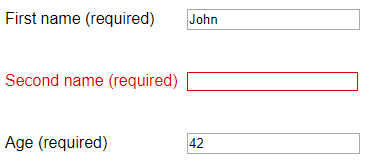
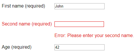
If highlighting form errors with a visual change, for example by placing a red border around a form field, also include an error message in text next to the field.
Links
Links embedded in sections of text should be underlined, have borders, or some other visual change as well as be in a different colour so they are easy to see.


Icons
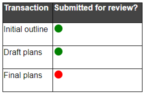
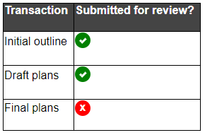
Icons must have different shapes, text labels, or some other visual change as well as different colours.
Graphs and charts
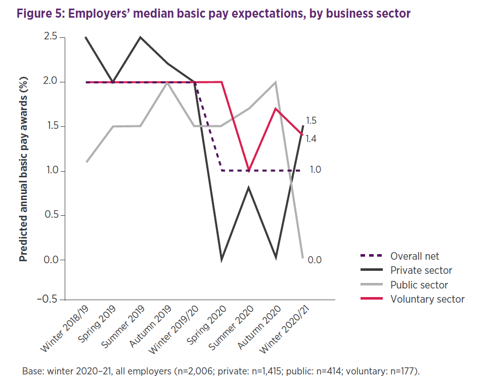
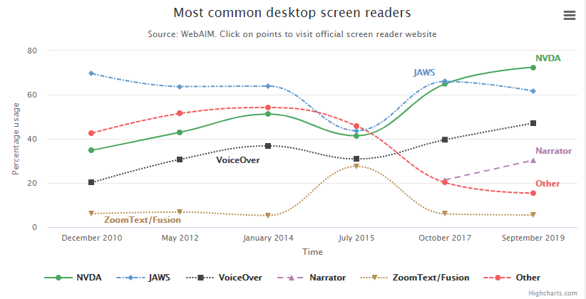
Graphs and charts must combine colour with text labels or patterns and legends.
Tips for using colour to convey meaning
- Design content without colour first, then add colour to reinforce meaning
- Switch your screen to black and white to see if you can identify links, error messages and other elements that convey meaning
Related standards
More information
For more information about the Web Content Accessibility Guidelines, read our WCAG primer and find out more about embedding accessibility into design in accessible design systems.
Next steps
Read more accessibility foundations posts or sign up for Accessibility Unlocked, our free six-day newsletter series designed to help you kick-start accessibility.
Updated 24 January 2023.


