If you've visited my site recently you might have noticed some illustrations I've done appear on some pages, notably the home page and my 404 page. I wanted to use this brick drawing I did for Inktober but on the dark mode background is doesn't look good:
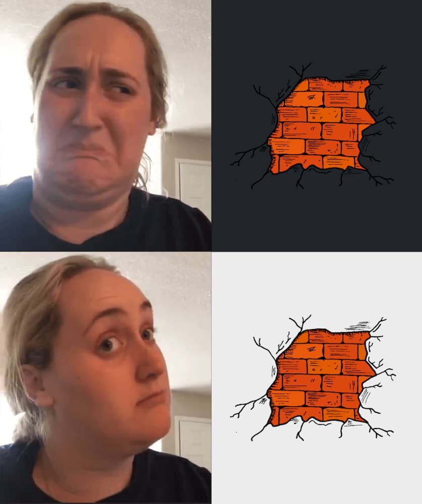
My first thought was to just get rid of dark mode completely and just have light mode. I spoke to a handful of people about it and came to the conclusion that this was an extreme solution. Also, I like dark mode in general so it seems stupid to nuke it just for this.
I tried a handful of different things like changing the line colour to white and just loading the correct version depending on the theme. This worked, but still looked shit on dark mode. I tried some other things like adding an outline or even a thicker line like a sticker might have but all of them had the same problem — I would need to make two versions of every drawing which I really didn't want to do.
I had a vague recollection of being able to do a drop shadow on transparent PNGs and after some digging I found it can be done with filter and drop-shadow. Stacking two drop shadows give the best outline for what I wanted.
filter: drop-shadow(0 0 1px #ececec) drop-shadow(0 0 1px #ececec);It's not perfect but it does the job, especially on drawings that have a more defined outline like the hats.
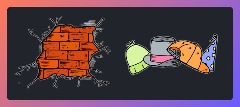
Now I can start adding some more illustrations I've got lined up for the site.


